Giving Form to Grief: Crafting The Solace's Identity
The Solace began as an idea to transform the way we navigate death—a space for comfort, reflection, and honest conversations about loss. Its visual identity, created by Dublin-based studio Wove, was designed to be uplifting while staying deeply rooted in empathy. We spoke with Wove’s design lead, Catherine Robertson, about the challenge of giving a visual form to the concept of solace.
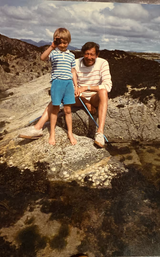
The Solace was born out of an intensely personal experience, one that left its founder, Mark Legge, feeling the deep, disorienting ache of loss when his father passed away several years ago. As he sought solace in those days, Mark, like many, encountered a landscape of services that felt painfully clinical and perfunctory. His search for comfort and connection led only to a sense of frustration and a stark realisation: the very act of grieving, one of the most personal experiences, seemed met with options that were largely impersonal. He envisioned something radically different: a space that could hold both the rawness of grief and the beauty of remembrance.
The Solace was conceived to bridge the gap between support and connection, offering clarity and empathy. More than just a service—it’s a sanctuary where grief is met with grace, where lives are celebrated, and where finding comfort becomes a shared journey toward healing.
The Solace isn’t just a service—it’s a sanctuary where grief is met with grace, where lives are celebrated, and where finding comfort becomes a shared journey toward healing.
The Solace’s visual identity stands apart from anything else in the death space. It is both clear and authoritative yet gentle and uplifting—infused with warm colours and soft edges. The logo, an abstract embrace, draws you in. “Our main aim was that people should feel that it's sincere,” says Catherine Robertson, design lead at strategic design firm Wove, who worked closely with Mark on all aspects of the visual identity. “We wanted people to know that The Solace is authentic, created by those who genuinely want to offer support during life’s difficult moments.”
Naming The Solace
The brief that Mark gave to Wove was broad, encompassing everything from the development of visual assets to brand storytelling and establishing the service’s position in the marketplace. “The first thing we developed with Mark was the name,” recalls Catherine. “Choosing a name was really challenging, just by the sensitive nature of the project itself. Everything that you position can have multiple meanings to different people.”
Through a series of workshops with Mark and the team, Wove began exploring and then whittling down an extensive list of different name possibilities. “We actually moved into brand development as the name was still being finalised, because, with something like that, you need to sit with it just to make sure it's the right fit," says Catherine.
After several rounds of exploration, the team settled on The Solace, a choice they kept returning to for its depth and sense of calm. Meaning comfort in grief, Solace is the emotional quotient that comes as a result of support. As such, it felt like a fitting choice, embodying the brand’s mission to help people feel seen and understood in the face of loss; to share the weight of grief to provide moments of relief and lightness.
Colour & Texture as Emotional Tools
“Early in the process, the team came across a quote from David Attenborough that served as a grounding point for a lot of our research,” says Catherine, recalling the quote, ‘In times of crisis, the natural world is a source of both joy and solace. The natural world produces the comfort that can come from nothing else.’ “We always thought that that was a really beautiful statement and one that really resonated with Mark.”
The wide-ranging spectrum of colours reflects the many moods of grief, from moments of grounding and resilience to flashes of optimism and hope.
Rooted in nature, The Solace’s colour palette is informed by Ireland’s natural landscape: from the earthy consolations of the land, the changing hues of the ocean, to the warm optimism of a sunrise and the calming serenity of a sunset. The wide-ranging spectrum of colours reflects the many moods of grief, from moments of grounding and resilience to flashes of optimism and hope. To convey a feeling of warmth, a sand background colour is used as a substitute for bright white and The Solace’s core green can be used as an alternative for black. “Our palette is broad, with a range of bright and dark tones, to allow us to be respectful to the varying sensitivities of this space,” explains Robertson. “Grief is complex, and this palette helps to create a space where those feelings can coexist and evolve.”
In addition to the colour palette, Wove developed what Catherine describes as “a series of textures” made up of softly blurred images of landscapes and elements from nature that evoke the feeling of a memory—familiar but slightly softened, like recalling a moment from the past. These textures serve as gentle, unobtrusive backdrops for interactions across the page and screen, creating a visual pause that allows space for quiet reflection.
Logo & Typeface: Symbolism in Design
Ritual, community, and remembrance are woven together throughout every element of the brand. A line of research into death culture in Ireland—specifically the ancient tradition of standing stones—led to the development of a logo. Found in the landscape across the country, these vast boulders are embedded into the ground, usually arranged in circles related to the rising and setting sun at sacred times of the year. Their purpose remains unknown, although they are believed to have been used for rituals and ceremonies that would have brought comfort and peace.
Open to interpretation, much like an individual’s journey through grief, the logo invites viewers to find their own meaning.
In tandem with this thread, the team studied human interactions and body language around grieving, creating a series of abstract, loose sketches that spoke a universal language. These sketches evolved into a logo—three simple forms stacked together to resemble an embrace, but could also be read as a stack of stones or a landscape with a setting or rising sun. Open to interpretation, much like an individual’s journey through grief, the logo invites viewers to find their own meaning. An accompanying logotype combines softness with sharpness, relaxed yet human, with a subtle ligature between the ‘c’ and ‘e’ suggesting connection.
For a typeface, the team settled on a serif design called Reckless, which is ironic as the decision was anything but. “Something too rounded might have felt too juvenile or naive—which didn't feel right in this space—but anything too serious didn’t work either,” says Catherine noting that it also needed to be highly optimised as The Solace will primarily be a digital experience. “We went through a lot of serifs until we landed on Reckless, which felt like a good balance of being respectful, approachable, and warm.”
A Space for Healing
Ultimately, grief, loss, and death are unique experiences for everyone; no death is the same. The Solace acknowledges this, aiming to serve as a truly open space for people with different cultural and religious perspectives; a space where they feel able to share their experiences and learn from the experiences of others—to find solace in community.
“A guiding principle throughout the process was that it couldn't feel too branded,” explains Catherine, “which is such a strange thing when you're designing a brand. It needed to feel like a consistent and cohesive experience and not like it was a product that was being pushed on people in a time of need. But we also didn’t want it to feel passive,” she adds. “This is a space to be a bit more provocative and have more open and honest conversations around death. A space for people who want to engage with it more and talk about it more, and that can only be a good thing.”


